
Most ecommerce stores do not fail because of traffic. They fail because the product page does not convince people to buy. A high converting product page removes doubt, builds trust, and makes the next step feel easy.
Here is the exact structure that winning stores use.
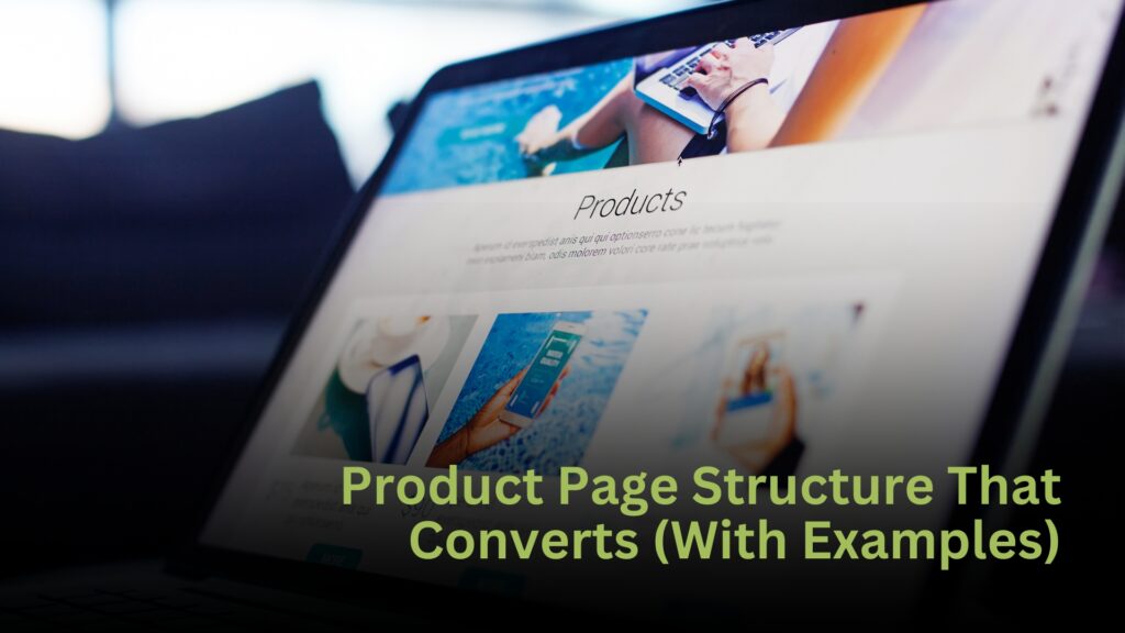
Section 1: The First Screen Must Sell
When someone lands on your page, you have about three seconds to grab attention.
This first section should include:
- A clear product image
- A simple headline that states the main benefit
- The price
- A visible buy button
Example:
Instead of “Wireless Earbuds,” say “Noise Canceling Earbuds That Let You Focus Anywhere.”
This tells the shopper what they get right away.
Section 2: Social Proof Right Under the Button
People do not trust brands. They trust other people.
Right below the buy button, show:
- Star ratings
- Short reviews
- Photos from real buyers
Example:
“Over 12,000 happy customers” with five stars beats a long paragraph of marketing copy.
Section 3: What Problem Does This Solve?
Now explain why this product exists.
Use simple language.
Focus on pain points.
Example for a posture corrector:
- Reduces back pain
- Improves posture
- Comfortable for daily wear
This helps buyers see how the product fits into their life.
Section 4: How It Works
Break down how the product works in three simple steps.
Example:
- Put it on
- Adjust the straps
- Feel the support
This removes confusion and makes the product feel easy to use.
Section 5: Images That Show the Outcome
Do not just show the product. Show the result.
Use:
- Lifestyle photos
- Before and after shots
- Close-ups of important features
People want to imagine themselves using it.
Section 6: What’s Included
List exactly what the customer gets.
Example:
- One posture corrector
- One carrying pouch
- Free shipping
This avoids surprises and builds trust.
Section 7: Shipping and Returns
Buyers worry about risk.
Tell them:
- How long shipping takes
- If there is free shipping
- How returns work
Clear policies increase conversions.
Section 8: FAQs
Add answers to common questions like:
- Does it fit all sizes?
- How long does it last?
- Is it washable?
This removes the last doubts before checkout.
Section 9: Final Call to Action
End the page with another buy button.
By now, the shopper should feel:
- Informed
- Safe
- Ready
Make it easy for them to take action.
Why This Structure Works
This layout matches how people think.
First they want to know what it is.
Then they want proof.
Then they want details.
Then they want safety.
When you follow this flow, more visitors turn into buyers.
Final Thoughts
You do not need more traffic to make more money. You need better pages.
Fix your product page structure and your conversions go up without spending more on ads.
That is how smart ecommerce brands grow.